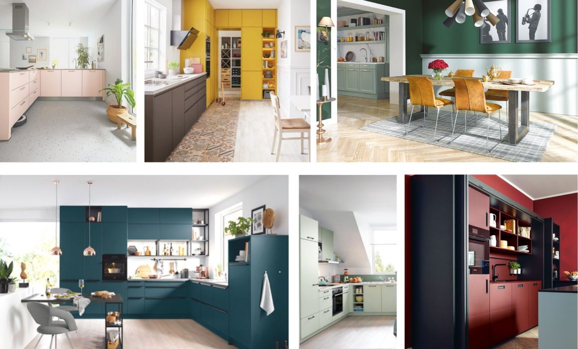
Colourful kitchens are bursting into 2021/22.
Time to dial up colour in the kitchen
Bright colours evoke a sense of vibrancy, energy and positivity. With a growing interest in connecting to nature, wellbeing, and positive change, bright and cheerful tones are bursting into every area of the home. Could this be the end of the all white, all natural Instagram aesthetic? Well, times are a-changing and bold, saturated colours are going to see a huge renaissance over the coming months leading to some beautiful colourful kitchens.
As society encounters new and difficult challenges, there’s an increasing demand for organic yet bright and colourful tones that provide stability and optimism. In a recent report, the Pantone Colour Institute predicted ten colours that we should expect to see on the runway and in the home. The palette is bold, playful, fruity and fresh, offering a much-needed burst of energy and joy. Bring on the colourful kitchens.
Ocean blue kitchens
Verdigris sits comfortably between green and blue, with tones baring a striking resemblance to the Atlantic Ocean. It has the ability to give interiors an organic and earthy feel while remaining contemporary and bold. With wild swimming, rewilding, and outdoorsy lifestyles gaining increasing popularity, it won’t be long before homes and interiors offer equally refreshing outlooks.
“Verdigris blues play on the luxury of escapism, offering a vision of tranquillity and leisure” says Wayne Dance, Managing Director. “Marine and teal hues are classic trans-seasonal colours that help the home feel warm and inviting all year round. Up the ante by matching your kitchen with co-ordinating cushions, tableware and furniture.”
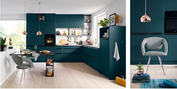
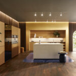
The stunning combination of deep teal blue with brass fittings and soft wood flooring creates a retro and glamorous look with understated elegance. Be bold while maintaining a sense of order and comfort with the Siena kitchen from Schüller.
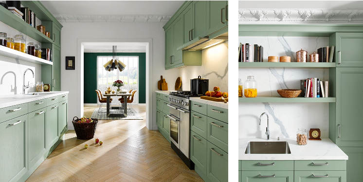
Sage green kitchens
A growing focus on personal wellbeing and environmental restoration will see soft green palettes extend far beyond the vegetable patch. Muted sage and mint greens offer a connection to the earthy and wild spaces around while creating a gentle and comforting atmosphere. If you love pastels but find candyfloss pink too girly, restorative greens are a fresh and trendy alternative for colourful kitchens.
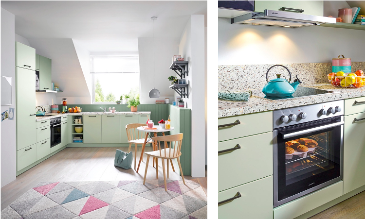
Embrace nostalgia with a pastel green kitchen complete with terrazzo work surfaces. The antithesis of squeaky clean interiors and digital culture, pastels and terrazzo are bright, playful and full of texture.
If resilience and health are high on your priorities, make sure you include grounding, natural tones in your kitchen and living space. Sage green is nourishing, earthy and provides a reassuring sense of balance and calm when applied to interiors.
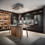
Forest green kitchens
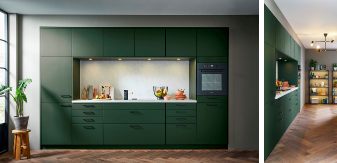
Forest green continues to be a popular shade for those seeking to bring the outdoors in. Deep dark greens resonate with people and communities who reconnected with nature during the pandemic. After spending months indoors, it makes sense that we are now yearning for a renewed sense of connection with the natural world.
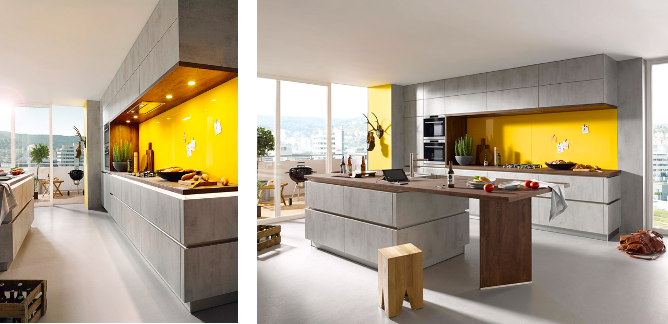
Lemon yellow kitchens
After a year of uncertainty, bright yellows offer a bold and uplifting boost of colour and positivity. As we emerge from a very drawn out hibernation, cheerful yellows provide a spark of light and an optimistic promise of better times ahead. An entirely yellow kitchen is a very brave move. So it may be worth considering a block of the bold sunshine shade with a soft, neural tone for balance. Consider pairing the bright colour with brown or grey to create an accent feature.
Ruby red kitchens
Last but certainly not least, we have deep warm reds. Throughout history, red has been used to symbolise power, prosperity and a hint of danger. In some cultures, the colour red is meant to bring you good fortune. Red is not commonly found in the kitchen, yet there is a huge opportunity to harness the deep crimson tones. These reds help to create confident and sophisticated colourful kitchens for entertaining guests.
“If there’s one thing this year has taught us about interiors, it has got to be the simple reminder that the home should be our individual sanctuary, designed in line with our own personal tastes and needs,” says Wayne Dance, Managing Director. “Gone are the days of blindly following trends, so expect to see more playful and bold uses of colour throughout the house in 2021/22. Prepare to be unconventional.”
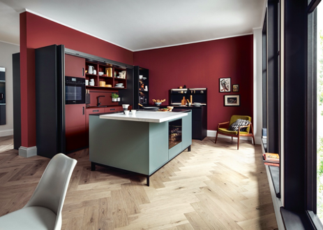
Here deep red and matt black are effortlessly combined to create a sumptuous and relaxing kitchen that injects luscious style into the home. And the best part about this kitchen? When you’ve finished dining, simply slide the doors shut and tuck away appliances and clutter.